一、今日学习目标
1.自定义指令
- 基本语法(全局、局部注册)
- 指令的值
- v-loading的指令封装
2.插槽
3.综合案例:商品列表
4.路由入门
二、自定义指令
1.指令介绍
2.自定义指令
概念:自己定义的指令,可以封装一些DOM操作,扩展额外的功能
3.自定义指令语法
4.指令中的配置项介绍
inserted:被绑定元素插入父节点时调用的钩子函数
el:使用指令的那个DOM元素
5.代码示例
需求:当页面加载时,让元素获取焦点(autofocus在safari浏览器有兼容性)
App.vue
1
2
3
4
| <div>
<h1>自定义指令</h1>
<input v-focus ref="inp" type="text">
</div>
|
6.总结
1.自定义指令的作用是什么?
2.使用自定义指令的步骤是哪两步?
三、自定义指令-指令的值
1.需求
实现一个 color 指令 - 传入不同的颜色, 给标签设置文字颜色
2.语法
1.在绑定指令时,可以通过“等号”的形式为指令 绑定 具体的参数值
1
| <div v-color="color">我是内容</div>
|
2.通过 binding.value 可以拿到指令值,指令值修改会 触发 update 函数
1
2
3
4
5
6
7
8
9
10
| directives: {
color: {
inserted (el, binding) {
el.style.color = binding.value
},
update (el, binding) {
el.style.color = binding.value
}
}
}
|
3.代码示例
App.vue
1
2
3
4
5
6
7
8
9
10
11
12
13
14
15
16
17
18
19
20
21
22
23
24
25
26
| <template>
<div>
<!--显示红色-->
<h2 v-color="color1">指令的值1测试</h2>
<!--显示蓝色-->
<h2 v-color="color2">指令的值2测试</h2>
<button>
改变第一个h1的颜色
</button>
</div>
</template>
<script>
export default {
data () {
return {
color1: 'red',
color2: 'blue'
}
}
}
</script>
<style>
</style>
|
四、自定义指令-v-loading指令的封装
1.场景
实际开发过程中,发送请求需要时间,在请求的数据未回来时,页面会处于空白状态 => 用户体验不好
2.需求
封装一个 v-loading 指令,实现加载中的效果
3.分析
1.本质 loading效果就是一个蒙层,盖在了盒子上
2.数据请求中,开启loading状态,添加蒙层
3.数据请求完毕,关闭loading状态,移除蒙层
4.实现
1.准备一个 loading类,通过伪元素定位,设置宽高,实现蒙层
2.开启关闭 loading状态(添加移除蒙层),本质只需要添加移除类即可
3.结合自定义指令的语法进行封装复用
1
2
3
4
5
6
7
8
9
| .loading:before {
content: "";
position: absolute;
left: 0;
top: 0;
width: 100%;
height: 100%;
background: #fff url("./loading.gif") no-repeat center;
}
|
5.准备代码
1
2
3
4
5
6
7
8
9
10
11
12
13
14
15
16
17
18
19
20
21
22
23
24
25
26
27
28
29
30
31
32
33
34
35
36
37
38
39
40
41
42
43
44
45
46
47
48
49
50
51
52
53
54
55
56
57
58
59
60
61
62
63
64
65
66
67
68
69
70
71
72
73
74
75
76
77
78
79
80
81
82
83
84
85
86
87
88
89
90
91
92
93
94
95
96
97
98
99
100
101
102
103
104
105
106
107
108
| <template>
<div class="main">
<div class="box">
<ul>
<li v-for="item in list" :key="item.id" class="news">
<div class="left">
<div class="title">{{ item.title }}</div>
<div class="info">
<span>{{ item.source }}</span>
<span>{{ item.time }}</span>
</div>
</div>
<div class="right">
<img :src="item.img" alt="">
</div>
</li>
</ul>
</div>
</div>
</template>
<script>
import axios from 'axios'
export default {
data () {
return {
list: [],
isLoading: false,
isLoading2: false
}
},
async created () {
const res = await axios.get('http://hmajax.itheima.net/api/news')
setTimeout(() => {
this.list = res.data.data
}, 2000)
}
}
</script>
<style>
.loading:before {
content: '';
position: absolute;
left: 0;
top: 0;
width: 100%;
height: 100%;
background: #fff url('./loading.gif') no-repeat center;
}
.box2 {
width: 400px;
height: 400px;
border: 2px solid #000;
position: relative;
}
.box {
width: 800px;
min-height: 500px;
border: 3px solid orange;
border-radius: 5px;
position: relative;
}
.news {
display: flex;
height: 120px;
width: 600px;
margin: 0 auto;
padding: 20px 0;
cursor: pointer;
}
.news .left {
flex: 1;
display: flex;
flex-direction: column;
justify-content: space-between;
padding-right: 10px;
}
.news .left .title {
font-size: 20px;
}
.news .left .info {
color: #999999;
}
.news .left .info span {
margin-right: 20px;
}
.news .right {
width: 160px;
height: 120px;
}
.news .right img {
width: 100%;
height: 100%;
object-fit: cover;
}
</style>
|
五、插槽-默认插槽
1.作用
让组件内部的一些 结构 支持 自定义
2.需求
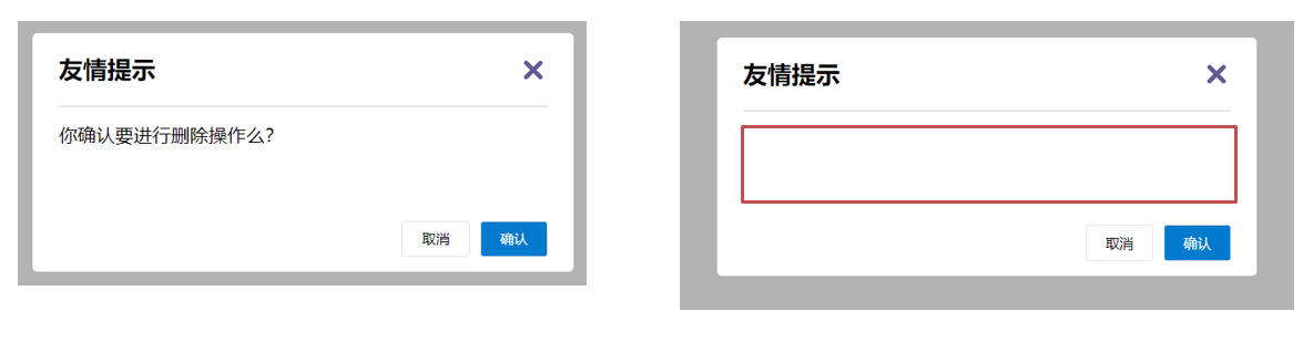
将需要多次显示的对话框,封装成一个组件
3.问题
组件的内容部分,不希望写死,希望能使用的时候自定义。怎么办
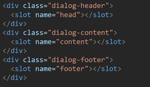
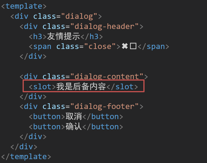
4.插槽的基本语法
- 组件内需要定制的结构部分,改用****占位
- 使用组件时, ****标签内部, 传入结构替换slot
- 给插槽传入内容时,可以传入纯文本、html标签、组件
5.代码示例
MyDialog.vue
1
2
3
4
5
6
7
8
9
10
11
12
13
14
15
16
17
18
19
20
21
22
23
24
25
26
27
28
29
30
31
32
33
34
35
36
37
38
39
40
41
42
43
44
45
46
47
48
49
50
51
52
53
54
55
56
57
58
59
60
61
62
63
64
65
66
67
68
69
70
71
72
73
74
75
76
77
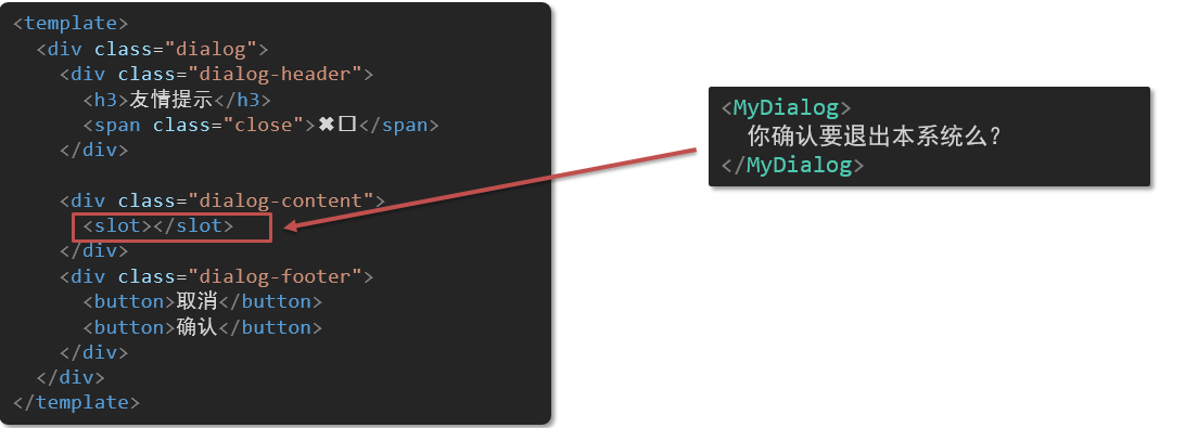
| <template>
<div class="dialog">
<div class="dialog-header">
<h3>友情提示</h3>
<span class="close">✖️</span>
</div>
<div class="dialog-content">
您确定要进行删除操作吗?
</div>
<div class="dialog-footer">
<button>取消</button>
<button>确认</button>
</div>
</div>
</template>
<script>
export default {
data () {
return {
}
}
}
</script>
<style scoped>
* {
margin: 0;
padding: 0;
}
.dialog {
width: 470px;
height: 230px;
padding: 0 25px;
background-color: #ffffff;
margin: 40px auto;
border-radius: 5px;
}
.dialog-header {
height: 70px;
line-height: 70px;
font-size: 20px;
border-bottom: 1px solid #ccc;
position: relative;
}
.dialog-header .close {
position: absolute;
right: 0px;
top: 0px;
cursor: pointer;
}
.dialog-content {
height: 80px;
font-size: 18px;
padding: 15px 0;
}
.dialog-footer {
display: flex;
justify-content: flex-end;
}
.dialog-footer button {
width: 65px;
height: 35px;
background-color: #ffffff;
border: 1px solid #e1e3e9;
cursor: pointer;
outline: none;
margin-left: 10px;
border-radius: 3px;
}
.dialog-footer button:last-child {
background-color: #007acc;
color: #fff;
}
</style>
|
App.vue
1
2
3
4
5
6
7
8
9
10
11
12
13
14
15
16
17
18
19
20
21
22
23
24
25
26
| <template>
<div>
<MyDialog>
</MyDialog>
</div>
</template>
<script>
import MyDialog from './components/MyDialog.vue'
export default {
data () {
return {
}
},
components: {
MyDialog
}
}
</script>
<style>
body {
background-color: #b3b3b3;
}
</style>
|
6.总结
场景:组件内某一部分结构不确定,想要自定义怎么办
使用:插槽的步骤分为哪几步?
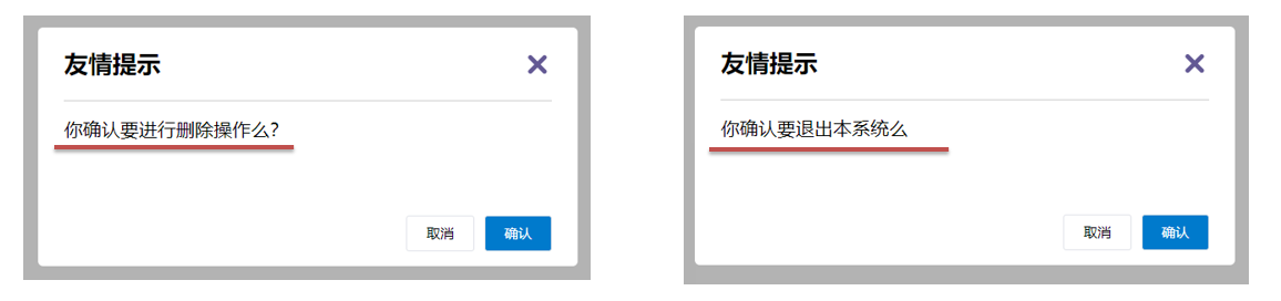
六、插槽-后备内容(默认值)
1.问题
通过插槽完成了内容的定制,传什么显示什么, 但是如果不传,则是空白
能否给插槽设置 默认显示内容 呢?
2.插槽的后备内容
封装组件时,可以为预留的 <slot> 插槽提供后备内容(默认内容)。
3.语法
在 标签内,放置内容, 作为默认显示内容
4.效果
5.代码示例
App.vue
1
2
3
4
5
6
7
8
9
10
11
12
13
14
15
16
17
18
19
20
21
22
23
24
25
26
27
28
| <template>
<div>
<MyDialog></MyDialog>
<MyDialog>
你确认要退出么
</MyDialog>
</div>
</template>
<script>
import MyDialog from './components/MyDialog.vue'
export default {
data () {
return {
}
},
components: {
MyDialog
}
}
</script>
<style>
body {
background-color: #b3b3b3;
}
</style>
|
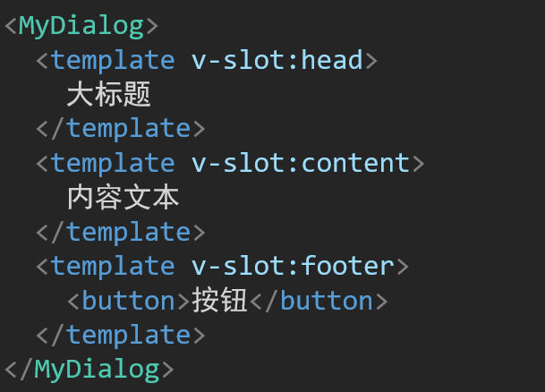
七、插槽-具名插槽
1.需求
一个组件内有多处结构,需要外部传入标签,进行定制 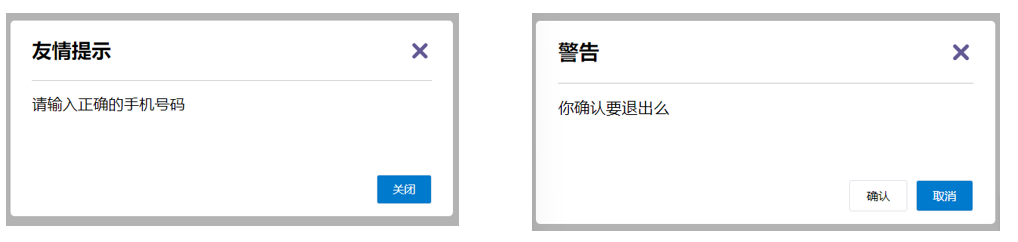
上面的弹框中有三处不同,但是默认插槽只能定制一个位置,这时候怎么办呢?
2.具名插槽语法
3.v-slot的简写
v-slot写起来太长,vue给我们提供一个简单写法 v-slot —> #
4.总结
- 组件内 有多处不确定的结构 怎么办?
- 具名插槽的语法是什么?
- v-slot:插槽名可以简化成什么?
八、作用域插槽
1.插槽分类
默认插槽
具名插槽
插槽只有两种,作用域插槽不属于插槽的一种分类
2.作用
定义slot 插槽的同时, 是可以传值的。给 插槽 上可以 绑定数据,将来 使用组件时可以用
3.场景
封装表格组件
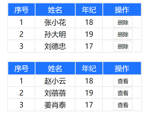
4.使用步骤
给 slot 标签, 以 添加属性的方式传值
1
| <slot :id="item.id" msg="测试文本"></slot>
|
所有添加的属性, 都会被收集到一个对象中
在template中, 通过 #插槽名= "obj" 接收,默认插槽名为 default
1
2
3
4
5
| <MyTable :list="list">
<template #default="obj">
<button @click="del(obj.id)">删除</button>
</template>
</MyTable>
|
5.代码示例
MyTable.vue
1
2
3
4
5
6
7
8
9
10
11
12
13
14
15
16
17
18
19
20
21
22
23
24
25
26
27
28
29
30
31
32
33
34
35
36
37
38
39
40
41
42
43
44
45
46
47
48
49
50
51
52
53
54
55
56
57
58
59
60
61
62
63
64
65
66
67
68
69
70
71
72
73
74
75
76
77
78
79
80
81
82
83
84
85
86
87
88
89
90
91
92
93
94
| <template>
<table class="my-table">
<thead>
<tr>
<th>序号</th>
<th>姓名</th>
<th>年纪</th>
<th>操作</th>
</tr>
</thead>
<tbody>
<tr>
<td>1</td>
<td>赵小云</td>
<td>19</td>
<td>
<button>
查看
</button>
</td>
</tr>
<tr>
<td>1</td>
<td>张小花</td>
<td>19</td>
<td>
<button>
查看
</button>
</td>
</tr>
<tr>
<td>1</td>
<td>孙大明</td>
<td>19</td>
<td>
<button>
查看
</button>
</td>
</tr>
</tbody>
</table>
</template>
<script>
export default {
props: {
data: Array
}
}
</script>
<style scoped>
.my-table {
width: 450px;
text-align: center;
border: 1px solid #ccc;
font-size: 24px;
margin: 30px auto;
}
.my-table thead {
background-color: #1f74ff;
color: #fff;
}
.my-table thead th {
font-weight: normal;
}
.my-table thead tr {
line-height: 40px;
}
.my-table th,
.my-table td {
border-bottom: 1px solid #ccc;
border-right: 1px solid #ccc;
}
.my-table td:last-child {
border-right: none;
}
.my-table tr:last-child td {
border-bottom: none;
}
.my-table button {
width: 65px;
height: 35px;
font-size: 18px;
border: 1px solid #ccc;
outline: none;
border-radius: 3px;
cursor: pointer;
background-color: #ffffff;
margin-left: 5px;
}
</style>
|
App.vue
1
2
3
4
5
6
7
8
9
10
11
12
13
14
15
16
17
18
19
20
21
22
23
24
25
26
27
28
29
| <template>
<div>
<MyTable :data="list"></MyTable>
<MyTable :data="list2"></MyTable>
</div>
</template>
<script>
import MyTable from './components/MyTable.vue'
export default {
data () {
return {
list: [
{ id: 1, name: '张小花', age: 18 },
{ id: 2, name: '孙大明', age: 19 },
{ id: 3, name: '刘德忠', age: 17 },
],
list2: [
{ id: 1, name: '赵小云', age: 18 },
{ id: 2, name: '刘蓓蓓', age: 19 },
{ id: 3, name: '姜肖泰', age: 17 },
]
}
},
components: {
MyTable
}
}
</script>
|
6.总结
1.作用域插槽的作用是什么?
2.作用域插槽的使用步骤是什么?
九、综合案例 - 商品列表-MyTag组件抽离
1.需求说明
- my-tag 标签组件封装
(1) 双击显示输入框,输入框获取焦点
(2) 失去焦点,隐藏输入框
(3) 回显标签信息
(4) 内容修改,回车 → 修改标签信息
- my-table 表格组件封装
(1) 动态传递表格数据渲染
(2) 表头支持用户自定义
(3) 主体支持用户自定义
2.代码准备
1
2
3
4
5
6
7
8
9
10
11
12
13
14
15
16
17
18
19
20
21
22
23
24
25
26
27
28
29
30
31
32
33
34
35
36
37
38
39
40
41
42
43
44
45
46
47
48
49
50
51
52
53
54
55
56
57
58
59
60
61
62
63
64
65
66
67
68
69
70
71
72
73
74
75
76
77
78
79
80
81
82
83
84
85
86
87
88
89
90
91
92
93
94
95
96
97
98
99
100
101
102
103
104
105
106
107
108
109
110
111
112
113
114
115
116
117
118
119
120
121
122
123
124
125
126
127
128
129
130
131
132
133
134
135
136
137
138
139
140
141
142
143
144
145
146
147
148
149
150
151
152
153
154
155
156
157
| <template>
<div class="table-case">
<table class="my-table">
<thead>
<tr>
<th>编号</th>
<th>名称</th>
<th>图片</th>
<th width="100px">标签</th>
</tr>
</thead>
<tbody>
<tr>
<td>1</td>
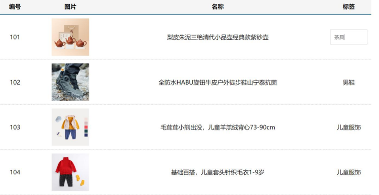
<td>梨皮朱泥三绝清代小品壶经典款紫砂壶</td>
<td>
<img src="https://yanxuan-item.nosdn.127.net/f8c37ffa41ab1eb84bff499e1f6acfc7.jpg" />
</td>
<td>
<div class="my-tag">
<!-- <input
class="input"
type="text"
placeholder="输入标签"
/> -->
<div class="text">
茶具
</div>
</div>
</td>
</tr>
<tr>
<td>1</td>
<td>梨皮朱泥三绝清代小品壶经典款紫砂壶</td>
<td>
<img src="https://yanxuan-item.nosdn.127.net/221317c85274a188174352474b859d7b.jpg" />
</td>
<td>
<div class="my-tag">
<!-- <input
ref="inp"
class="input"
type="text"
placeholder="输入标签"
/> -->
<div class="text">
男靴
</div>
</div>
</td>
</tr>
</tbody>
</table>
</div>
</template>
<script>
export default {
name: 'TableCase',
components: {},
data() {
return {
goods: [
{
id: 101,
picture:
'https://yanxuan-item.nosdn.127.net/f8c37ffa41ab1eb84bff499e1f6acfc7.jpg',
name: '梨皮朱泥三绝清代小品壶经典款紫砂壶',
tag: '茶具',
},
{
id: 102,
picture:
'https://yanxuan-item.nosdn.127.net/221317c85274a188174352474b859d7b.jpg',
name: '全防水HABU旋钮牛皮户外徒步鞋山宁泰抗菌',
tag: '男鞋',
},
{
id: 103,
picture:
'https://yanxuan-item.nosdn.127.net/cd4b840751ef4f7505c85004f0bebcb5.png',
name: '毛茸茸小熊出没,儿童羊羔绒背心73-90cm',
tag: '儿童服饰',
},
{
id: 104,
picture:
'https://yanxuan-item.nosdn.127.net/56eb25a38d7a630e76a608a9360eec6b.jpg',
name: '基础百搭,儿童套头针织毛衣1-9岁',
tag: '儿童服饰',
},
],
}
},
}
</script>
<style lang="less" scoped>
.table-case {
width: 1000px;
margin: 50px auto;
img {
width: 100px;
height: 100px;
object-fit: contain;
vertical-align: middle;
}
.my-table {
width: 100%;
border-spacing: 0;
img {
width: 100px;
height: 100px;
object-fit: contain;
vertical-align: middle;
}
th {
background: #f5f5f5;
border-bottom: 2px solid #069;
}
td {
border-bottom: 1px dashed #ccc;
}
td,
th {
text-align: center;
padding: 10px;
transition: all 0.5s;
&.red {
color: red;
}
}
.none {
height: 100px;
line-height: 100px;
color: #999;
}
}
.my-tag {
cursor: pointer;
.input {
appearance: none;
outline: none;
border: 1px solid #ccc;
width: 100px;
height: 40px;
box-sizing: border-box;
padding: 10px;
color: #666;
&::placeholder {
color: #666;
}
}
}
}
</style>
|
3.my-tag组件封装-创建组件
MyTag.vue
1
2
3
4
5
6
7
8
9
10
11
12
13
14
15
16
17
18
19
20
21
22
23
24
25
26
27
28
29
30
31
32
33
34
35
36
37
38
| <template>
<div class="my-tag">
<!-- <input
class="input"
type="text"
placeholder="输入标签"
/> -->
<div
class="text">
茶具
</div>
</div>
</template>
<script>
export default {
}
</script>
<style lang="less" scoped>
.my-tag {
cursor: pointer;
.input {
appearance: none;
outline: none;
border: 1px solid #ccc;
width: 100px;
height: 40px;
box-sizing: border-box;
padding: 10px;
color: #666;
&::placeholder {
color: #666;
}
}
}
</style>
|
App.vue
1
2
3
4
5
6
7
8
9
10
11
12
13
14
15
16
17
18
19
20
21
| <template>
...
<tbody>
<tr>
....
<td>
<MyTag></MyTag>
</td>
</tr>
</tbody>
...
</template>
<script>
import MyTag from './components/MyTag.vue'
export default {
name: 'TableCase',
components: {
MyTag,
},
....
</script>
|
十、综合案例-MyTag组件控制显示隐藏
MyTag.vue
1
2
3
4
5
6
7
8
9
10
11
12
13
14
15
16
17
18
19
20
21
22
23
24
25
26
27
28
29
30
31
32
33
34
| <template>
<div class="my-tag">
<input
v-if="isEdit"
v-focus
ref="inp"
class="input"
type="text"
placeholder="输入标签"
@blur="isEdit = false"
/>
<div
v-else
@dblclick="handleClick"
class="text">
茶具
</div>
</div>
</template>
<script>
export default {
data () {
return {
isEdit: false
}
},
methods: {
handleClick () {
this.isEdit = true
}
}
}
</script>
|
main.js
1
2
3
4
5
6
7
|
Vue.directive('focus', {
inserted (el) {
el.focus()
}
})
|
十一、综合案例-MyTag组件进行v-model绑定
App.vue
1
2
3
4
5
6
7
8
| <MyTag v-model="tempText"></MyTag>
<script>
export default {
data(){
tempText:'水杯'
}
}
</script>
|
MyTag.vue
1
2
3
4
5
6
7
8
9
10
11
12
13
14
15
16
17
18
19
20
21
22
23
24
25
26
27
28
29
30
31
32
33
34
35
36
37
38
39
40
41
42
43
44
45
46
| <template>
<div class="my-tag">
<input
v-if="isEdit"
v-focus
ref="inp"
class="input"
type="text"
placeholder="输入标签"
:value="value"
@blur="isEdit = false"
@keyup.enter="handleEnter"
/>
<div
v-else
@dblclick="handleClick"
class="text">
{{ value }}
</div>
</div>
</template>
<script>
export default {
props: {
value: String
},
data () {
return {
isEdit: false
}
},
methods: {
handleClick () {
this.isEdit = true
},
handleEnter (e) {
// 非空处理
if (e.target.value.trim() === '') return alert('标签内容不能为空')
this.$emit('input', e.target.value)
// 提交完成,关闭输入状态
this.isEdit = false
}
}
}
</script>
|
十二、综合案例-封装MyTable组件-动态渲染数据
App.vue
1
2
3
4
5
6
7
8
9
10
11
12
13
14
15
16
17
18
19
20
| <template>
<div class="table-case">
<MyTable :data="goods"></MyTable>
</div>
</template>
<script>
import MyTable from './components/MyTable.vue'
export default {
name: 'TableCase',
components: {
MyTable
},
data(){
return {
....
}
},
}
</script>
|
MyTable.vue
1
2
3
4
5
6
7
8
9
10
11
12
13
14
15
16
17
18
19
20
21
22
23
24
25
26
27
28
29
30
31
32
33
34
35
36
37
38
39
40
41
42
43
44
45
46
47
48
49
50
51
52
53
54
55
56
57
58
59
60
61
62
63
64
65
66
67
68
69
70
71
72
73
74
| <template>
<table class="my-table">
<thead>
<tr>
<th>编号</th>
<th>名称</th>
<th>图片</th>
<th width="100px">标签</th>
</tr>
</thead>
<tbody>
<tr v-for="(item, index) in data" :key="item.id">
<td>{{ index + 1 }}</td>
<td>{{ item.name }}</td>
<td>
<img
:src="item.picture"
/>
</td>
<td>
标签内容
<!-- <MyTag v-model="item.tag"></MyTag> -->
</td>
</tr>
</tbody>
</table>
</template>
<script>
export default {
props: {
data: {
type: Array,
required: true
}
}
};
</script>
<style lang="less" scoped>
.my-table {
width: 100%;
border-spacing: 0;
img {
width: 100px;
height: 100px;
object-fit: contain;
vertical-align: middle;
}
th {
background: #f5f5f5;
border-bottom: 2px solid #069;
}
td {
border-bottom: 1px dashed #ccc;
}
td,
th {
text-align: center;
padding: 10px;
transition: all .5s;
&.red {
color: red;
}
}
.none {
height: 100px;
line-height: 100px;
color: #999;
}
}
</style>
|
十三、综合案例-封装MyTable组件-自定义结构
App.vue
1
2
3
4
5
6
7
8
9
10
11
12
13
14
15
16
17
18
19
20
21
22
23
24
25
26
27
28
29
30
31
32
33
34
35
36
37
38
39
40
41
42
| <template>
<div class="table-case">
<MyTable :data="goods">
<template #head>
<th>编号</th>
<th>名称</th>
<th>图片</th>
<th width="100px">标签</th>
</template>
<template #body="{ item, index }">
<td>{{ index + 1 }}</td>
<td>{{ item.name }}</td>
<td>
<img
:src="item.picture"
/>
</td>
<td>
<MyTag v-model="item.tag"></MyTag>
</td>
</template>
</MyTable>
</div>
</template>
<script>
import MyTag from './components/MyTag.vue'
import MyTable from './components/MyTable.vue'
export default {
name: 'TableCase',
components: {
MyTag,
MyTable
},
data () {
return {
....
}
}
</script>
|
MyTable.vue
1
2
3
4
5
6
7
8
9
10
11
12
13
14
15
16
17
18
19
20
21
22
23
24
25
| <template>
<table class="my-table">
<thead>
<tr>
<slot name="head"></slot>
</tr>
</thead>
<tbody>
<tr v-for="(item, index) in data" :key="item.id">
<slot name="body" :item="item" :index="index" ></slot>
</tr>
</tbody>
</table>
</template>
<script>
export default {
props: {
data: {
type: Array,
required: true
}
}
};
</script>
|
十四、单页应用程序介绍
1.概念
单页应用程序:SPA【Single Page Application】是指所有的功能都在一个html页面上实现
2.具体示例
单页应用网站: 网易云音乐 https://music.163.com/
多页应用网站:京东 https://jd.com/
3.单页应用 VS 多页面应用
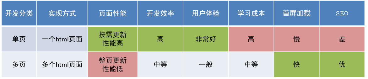
单页应用类网站:系统类网站 / 内部网站 / 文档类网站 / 移动端站点
多页应用类网站:公司官网 / 电商类网站
4.总结
1.什么是单页面应用程序?
2.单页面应用优缺点?
3.单页应用场景?
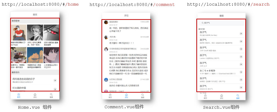
十五、路由介绍
1.思考
单页面应用程序,之所以开发效率高,性能好,用户体验好
最大的原因就是:页面按需更新
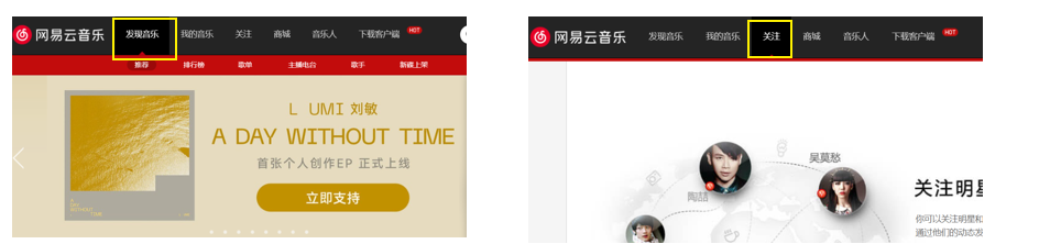
比如当点击【发现音乐】和【关注】时,只是更新下面部分内容,对于头部是不更新的
要按需更新,首先就需要明确:访问路径和 组件的对应关系!
访问路径 和 组件的对应关系如何确定呢? 路由
2.路由的介绍
生活中的路由:设备和ip的映射关系
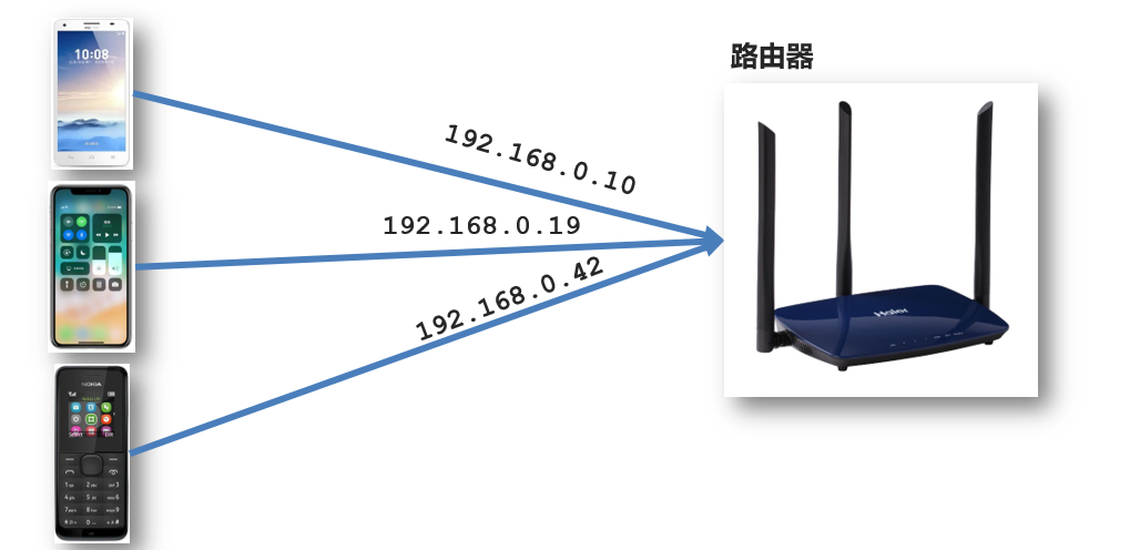
Vue中的路由:路径和组件的映射关系
3.总结
十六、路由的基本使用
1.目标
认识插件 VueRouter,掌握 VueRouter 的基本使用步骤
2.作用
修改地址栏路径时,切换显示匹配的组件
3.说明
Vue 官方的一个路由插件,是一个第三方包
4.官网
https://v3.router.vuejs.org/zh/
5.VueRouter的使用(5+2)
固定5个固定的步骤(不用死背,熟能生巧)
下载 VueRouter 模块到当前工程,版本3.6.5
1
| yarn add vue-router@3.6.5
|
main.js中引入VueRouter
1
| import VueRouter from 'vue-router'
|
安装注册
创建路由对象
1
| const router = new VueRouter()
|
注入,将路由对象注入到new Vue实例中,建立关联
1
2
3
4
5
| new Vue({
render: h => h(App),
router:router
}).$mount('#app')
|
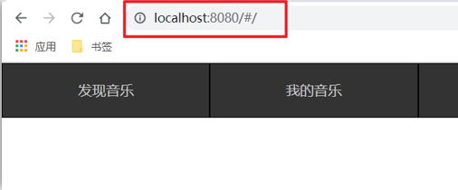
当我们配置完以上5步之后 就可以看到浏览器地址栏中的路由 变成了 /#/的形式。表示项目的路由已经被Vue-Router管理了
6.代码示例
main.js
1
2
3
4
5
6
7
8
9
10
11
12
13
14
15
16
17
18
19
| // 路由的使用步骤 5 + 2
// 5个基础步骤
// 1. 下载 v3.6.5
// yarn add vue-router@3.6.5
// 2. 引入
// 3. 安装注册 Vue.use(Vue插件)
// 4. 创建路由对象
// 5. 注入到new Vue中,建立关联
import VueRouter from 'vue-router'
Vue.use(VueRouter) // VueRouter插件初始化
const router = new VueRouter()
new Vue({
render: h => h(App),
router
}).$mount('#app')
|
7.两个核心步骤
创建需要的组件 (views目录),配置路由规则
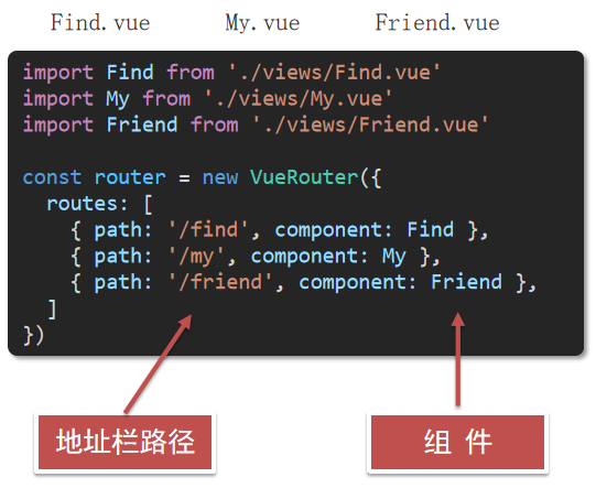
配置导航,配置路由出口(路径匹配的组件显示的位置)
App.vue
1
2
3
4
5
6
7
8
| <div class="footer_wrap">
<a href="#/find">发现音乐</a>
<a href="#/my">我的音乐</a>
<a href="#/friend">朋友</a>
</div>
<div class="top">
<router-view></router-view>
</div>
|
8.总结
- 如何实现 路径改变,对应组件 切换,应该使用哪个插件?
- Vue-Router的使用步骤是什么(5+2)?
十七、组件的存放目录问题
注意: .vue文件 本质无区别
1.组件分类
.vue文件分为2类,都是 .vue文件(本质无区别)
- 页面组件 (配置路由规则时使用的组件)
- 复用组件(多个组件中都使用到的组件)
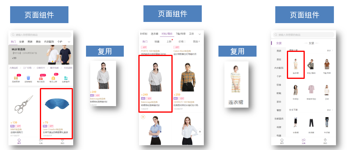
2.存放目录
分类开来的目的就是为了 更易维护
src/views文件夹
页面组件 - 页面展示 - 配合路由用
src/components文件夹
复用组件 - 展示数据 - 常用于复用
3.总结
- 组件分类有哪两类?分类的目的?
- 不同分类的组件应该放在什么文件夹?作用分别是什么?
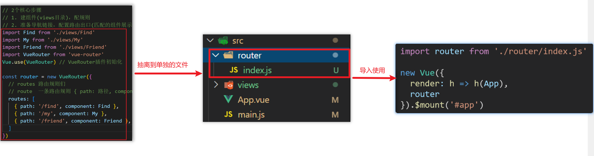
十八、路由的封装抽离
问题:所有的路由配置都在main.js中合适吗?
目标:将路由模块抽离出来。 好处:拆分模块,利于维护
路径简写:
脚手架环境下 @指代src目录,可以用于快速引入组件
总结:
- 路由模块的封装抽离的好处是什么?
- 以后如何快速引入组件?