css实现三角形的方法:
1、利用高宽为零的容器和透明的border;
2、利用线性渐变linear-gradient;
3、利用transform:rotate配合overflow:hidden
使用 border 属性
给定一个宽度和高度都为 0 的元素,其 border 的任何值都会直接相交,我们可以利用这个交点来创建三角形。也就是说,border属性是三角形组成的,下面给每一边都提供不同的边框颜色:
1
2
3
4
5
6
| .triangle {
width: 0;
height: 0;
border: 100px solid;
border-color: orangered skyblue gold yellowgreen;
}
|
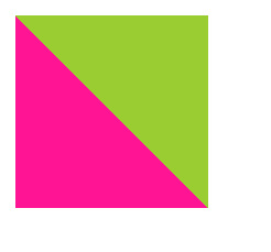
将元素的长宽都设置为0,效果是这样的:
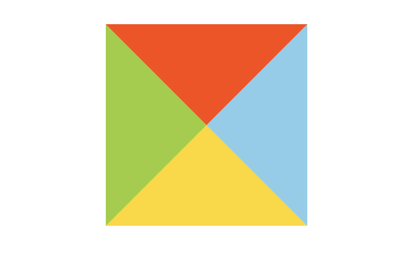
可以看到,我们已经基本上实现了4个三角形形状。所以可以根据border这个特性来绘制三角形。
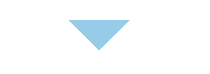
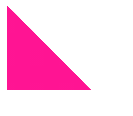
如果想要一个指向下面的三角形,可以让 border 的上边可见,其他边都设置为透明:
1
2
3
4
5
6
7
| .triangle {
width: 0;
height: 0;
border-top: 50px solid skyblue;
border-right: 50px solid transparent;
border-left: 50px solid transparent;
}
|
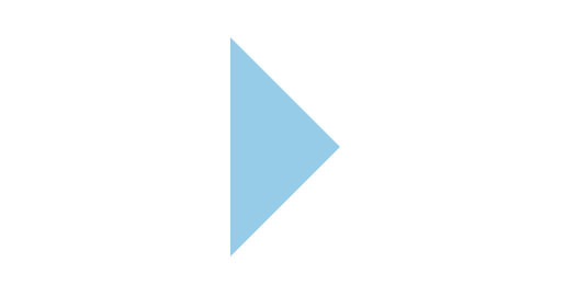
如果想要一个指向右面的三角形,可以让 border 的左边可见,其他边都设置为透明:
1
2
3
4
5
6
7
| .triangle {
width: 0;
height: 0;
border-left: 50px solid skyblue;
border-top: 50px solid transparent;
border-bottom: 50px solid transparent;
}
|
上面的代码也可以这样写:
1
2
3
4
5
6
| .triangle {
border-style: solid;
border-color: transparent;
border-width: 50px 0 50px 50px;
border-left-color: skyblue;
}
|
我们还可以通过调整不同方向边框的值来实现不同方向和大小的三角形:
1
2
3
4
5
6
| .triangle {
width: 0;
height: 0;
border-top: 100px solid skyblue;
border-right: 100px solid transparent;
}
|
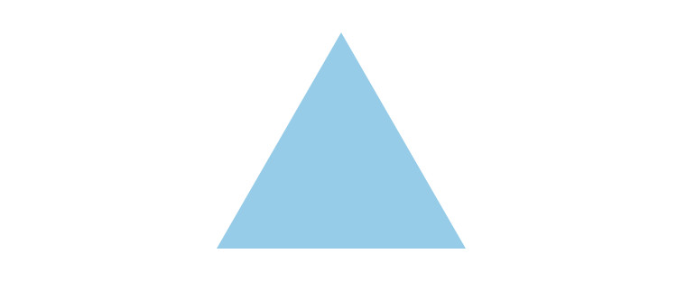
当然,实现一个等边三角形也是可以的:
1
2
3
4
5
6
7
| .triangle {
width: 0;
height: 0;
border-left: 69px solid transparent;
border-right: 69px solid transparent;
border-bottom: 120px solid skyblue;
}
|
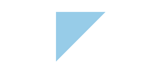
使用 linear-gradient 绘制三角形
首先我们实现一个45°的渐变
1
2
3
4
5
| div{
width: 100px;
height: 100px;
background: linear-gradient(45deg,deeppink,yellowgreen);
}
|
让它的颜色从渐变色变为两种固定的颜色:
1
2
3
4
5
6
| div{
width: 100px;
height: 100px;
background: linear-gradient(45deg,deeppink,deeppink 50%,
yellowgreen 50%,yellowgreen 100%);
}
|
再让其中一个颜色透明即可:
1
2
3
4
5
6
| div{
width: 100px;
height: 100px;
background: linear-gradient(45deg,deeppink,deeppink 50%,
transprant 50%,transprant 100%);
}
|
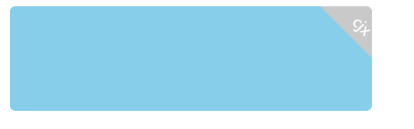
这是在项目开发中使用到的一个方法:三角形定位在盒子右上方
1
2
3
4
5
6
7
8
9
10
11
12
13
14
15
16
17
18
19
20
21
22
23
24
25
26
27
28
29
30
31
32
33
34
35
36
37
38
39
40
41
42
43
44
45
46
| <html>
<body>
<div class="box">
<div class="triangle">
<i></i>
<em>cjx</em>
</div>
</div>
</body>
</html>
<style>
.triangle{
background: skyblue;
width: 18.4rem;
height: 5.33rem;
margin-bottom: 0.56rem;
display: flex;
position: relative;
align-items: center;
border-radius: 0.27rem;
overflow: hidden;
}
i{
position: absolute;
border-bottom: 2rem solid #C9C9C9;
border-radius: 0rem 0rem 0rem 0rem;
border-left: 2rem solid transparent;
border-right: 2rem solid transparent;
-webkit-transform: rotate(45deg);
padding-left: 0px;
right:-1.4rem;
top:-0.4rem;
}
em{
font-size: 0.56rem;
font-weight: 400;
color: #FFFFFF;
position: absolute;
top: 0.5rem;
right: 0rem;
-webkit-transform: rotate(45deg);
padding-left: 0rem;
font-style: normal;
}
</style>
|